

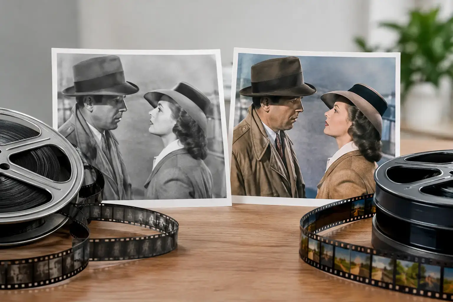
A black-and-white frame can make a 1940s detective story feel like it is happening after midnight, even when you watch it at noon. A colorized version of that same scene may reveal the burgundy wallpaper, the blue-gray smoke, and the warm glow of a desk lamp. That is the real appeal of colorized films versus original prints: viewers are not simply choosing between old and new. They are choosing two different ways to experience a piece of screen history.
For classic-film fans, there is no single correct answer. Original prints preserve the visual language audiences knew at the time. Colorized editions can make familiar titles feel immediate to viewers who may otherwise pass over black-and-white programming. The best choice depends on the title, the quality of the source material, and what you want from the viewing experience.
Why the Original Print Still Has Its Power
Black and white was never merely the absence of color. Directors, cinematographers, set designers, and costume departments built their work around light, shadow, texture, and contrast. In a film-noir mystery, a striped blind cutting across a character’s face can say more than a room full of colorful décor. In a classic western, dust against a bright sky creates a graphic, almost mythic image. The original monochrome print holds those choices together.
This matters especially for films designed around dramatic photography. A hard-boiled crime picture, a wartime short, or an early horror feature may rely on deep blacks and bright highlights to create tension. Grain can also be part of the pleasure. It reminds us that we are watching a physical film image, shaped by cameras, lenses, laboratories, and decades of careful survival.
Original prints also offer an important historical connection. They let modern audiences see a cartoon, serial chapter, or feature film close to the form in which earlier audiences encountered it. A Popeye short, a Superman adventure, or a fast-moving cliffhanger serial carries the look of its own era. For collectors and film-history fans, that authenticity is not a minor detail. It is part of the attraction.
Still, “original” does not always mean flawless. Surviving prints may have scratches, flicker, missing frames, weak contrast, or damage from years of circulation. A good restoration can stabilize the image and improve clarity while respecting the original black-and-white presentation. That kind of work helps a vintage title play smoothly on a modern screen without pretending it was made yesterday.
Colorized Films Versus Original Prints: What Changes?
Colorization changes the emotional temperature of a film. A scene that feels severe in black and white may become warmer, livelier, or more playful once color is added. That can be especially effective with broad comedy, family-friendly animation, musical sequences, and adventure serials where costumes, props, and settings benefit from extra visual separation.
At its best, colorization is a detailed interpretive process. Artists study grayscale values, production stills, costume records, period references, and the logic of the scene before assigning hues. Skin tones need to remain believable. Shadows must still look like shadows. A hero’s uniform, a nightclub interior, or a cartoon character’s signature look should feel consistent from shot to shot.
The trade-off is that color choices are, by necessity, choices made after the fact. Unless accurate production documentation exists, no one can know every original hue with complete certainty. A colorized edition may be faithful to the period and carefully researched, but it is still an enhanced presentation rather than the exact image audiences saw in the original release.
That does not make it a lesser experience. It makes it a different one. Think of a colorized edition as an alternate doorway into a classic title. It can invite a new viewer into an older story, make fine production details easier to notice, and help a beloved favorite feel fresh on a return visit.
When Color Can Be the Better First Watch
Some viewers have a strong emotional association with black-and-white films. Others simply do not. For a person browsing a classic catalog after dinner, a colorful thumbnail and a bright, enhanced image can be the difference between skipping a title and pressing play.
Colorization often works well for material built around action and personality. Animated shorts are a natural fit because color supports expressive character design, visual gags, and imaginative settings. Adventure serials can gain extra pop from vivid costumes, secret-lair machinery, jungle settings, and heroic set pieces. A light romantic comedy may also feel more inviting when the wardrobe and interiors have added dimension.
There is a generational benefit, too. Sharing classic entertainment with younger family members can be easier when the image feels visually familiar to them. The story, performance, and timing remain vintage, but color lowers one barrier to entry. A child who first meets a classic cartoon in color may later become curious enough to watch the original monochrome version as well.
The key is quality. Poor colorization can flatten faces, weaken shadows, or make a carefully composed scene look artificial. Thoughtful enhancement should preserve the original contrast and cinematic mood, not cover it with uniform, overly bright color. When color supports the image rather than competing with it, it can add genuine viewing value.
When Black and White Is the Essential Choice
There are titles where black and white is so closely tied to the mood that changing it alters the experience. Film noir is the clearest example. The genre thrives on silhouettes, wet streets, cigarette smoke, mirrored rooms, and faces half-hidden in darkness. Color can be interesting, but the original print often delivers the sharper sense of danger and moral uncertainty.
Silent films also deserve special consideration. Their visual storytelling is highly deliberate, with framing, performance, tinting when applicable, and lighting doing much of the narrative work. A clean restoration of an original presentation allows viewers to see that craftsmanship directly. The same is true for many wartime shorts and newsreel-era productions, where the period image carries documentary weight.
For serious collectors, original prints are also the natural reference point. If you are comparing performances, studying animation techniques, or appreciating vintage cinematography, starting with the historic presentation makes sense. It provides the baseline from which every remaster, cleanup, and colorized edition can be understood.
A Better Way to Watch Classic Screen History
The strongest classic-media libraries do not force audiences into one camp. They make room for both the archival experience and the enhanced one. A viewer might choose the original black-and-white version for a first encounter with a noir masterpiece, then revisit a colorized presentation to spot different production details. Another viewer may begin with color and work backward toward the original print once the characters and story have won them over.
That flexibility is especially valuable for classic cartoons, serials, and television. These were made to entertain, often at a brisk pace, and they still can. A restored image helps the action read clearly. A colorized version can add a new layer of accessibility. An original print keeps the historical character intact. Each presentation serves a distinct purpose.
HetFlix treats classic entertainment as something to watch, not merely admire from a distance. A cleaned-up and enhanced presentation can help a hard-to-find title earn another audience, while original-style versions preserve the textures that made vintage screen media memorable in the first place.
The next time you choose between a colorized edition and an original print, let the film guide you. Follow the shadows when the mood calls for mystery. Choose color when you want a familiar adventure or cartoon to feel newly alive. Either way, the reward is the same: another chance to spend time with stories that still know how to hold the screen.